Interface design & rhythm: The basics of composition in design

Welcome to our series on user interface design and rhythm.
We'll cover everything from composition basics to how they work together to create mesmerizing digital experiences. Learn about concepts, definitions, and real-world examples that will improve confidence in your approach to design.
What is interface design?
Since you’re here, the topic of interface design likely isn’t new to you. Still, let’s put things into perspective.
User interface (UI) design simply involves incorporating elements that usher users to an action.
Yet, at its core, it's the art of intuiting users' needs and crafting an interface that seamlessly fulfills those needs, all while maintaining visual appeal and usability.
Aside from being intuitive, UI designers accomplish effective interface design by leveraging one of the most powerful forces driving humanity: Rhythm.
But, before we discuss rhythm, we need to cover some basic elements of composition that make up a rhythm.
Composition and the heart of design
Composition, with its roots deeply entwined in all art forms, sits at the core of design. Let's start by delving into some key concepts, including "point", "line", "plane", and "vector", and review them in the context of web applications.
The building blocks of composition
Just as a melody is composed of notes, a design is composed of various elements.

Points
A point is a composition’s smallest element, serving as the focal centre of a composition. It can be very minor and bright, standing out from the overall composition. Or, it can be a negative space implied by other components.
Either way, it draws the viewers' attention.

Lines
Lines serve as navigational tools, steering the observer's attention towards a specific point. In a two-axis composition, whether it's horizontal or vertical, lines can converge our attention and establish a point. They can work together to form any shape, even outlining a coloured entity to create contrast with the backdrop.

Planes
Planes are formed by connecting points, crafting larger shapes that stand out. A striking example is the attention vector—an abstract concept that guides our focus. Its power lies in forming a trajectory our eyes follow naturally. The trajectory is affected by the elements' sizes, transparency, and positioning as they work together.
Grabbing attention with interface design

Minimalism helps automatically draw the user’s attention to the headline, which forms the biggest plane. The user is then steered toward the points along the baselines, which include hyperlinks and captions.

In more complex and content-heavy designs, a point can highlight navigation. Vertical lines guide our eyes from the headline to the navigation items at the top corner and below the fold.

These little components all work together to promote a specific trajectory through the logo, across the navigation icon, and over other titles.
These few basic elements come together in perfect harmony to prompt your users to learn more about your product or service, click that play button, or scroll further.
Speaking of harmony, weren’t we supposed to learn about rhythm? Stay tuned for part 2 in this series.
Share it with your peeps
Some more good reads
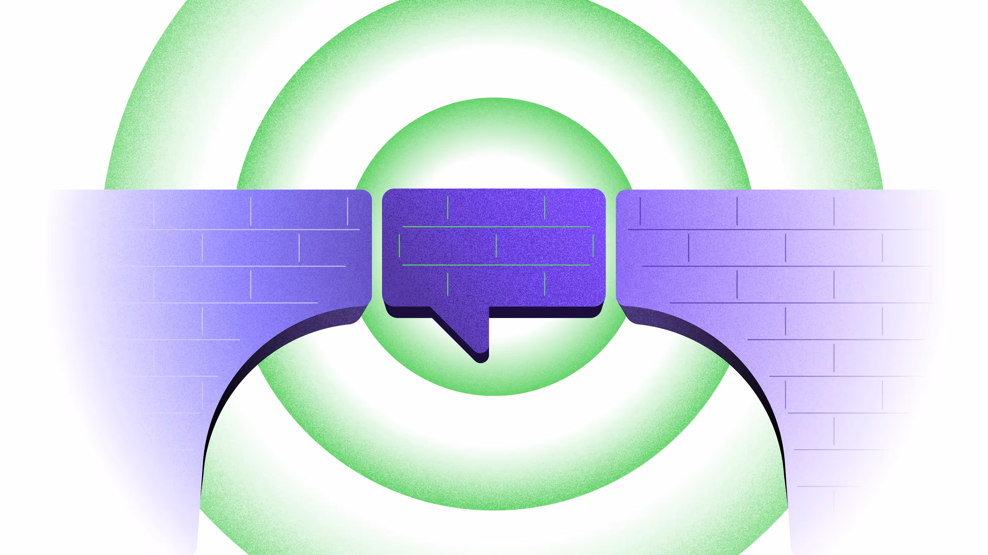
Language as a bridge: Why building business fluency matters in design
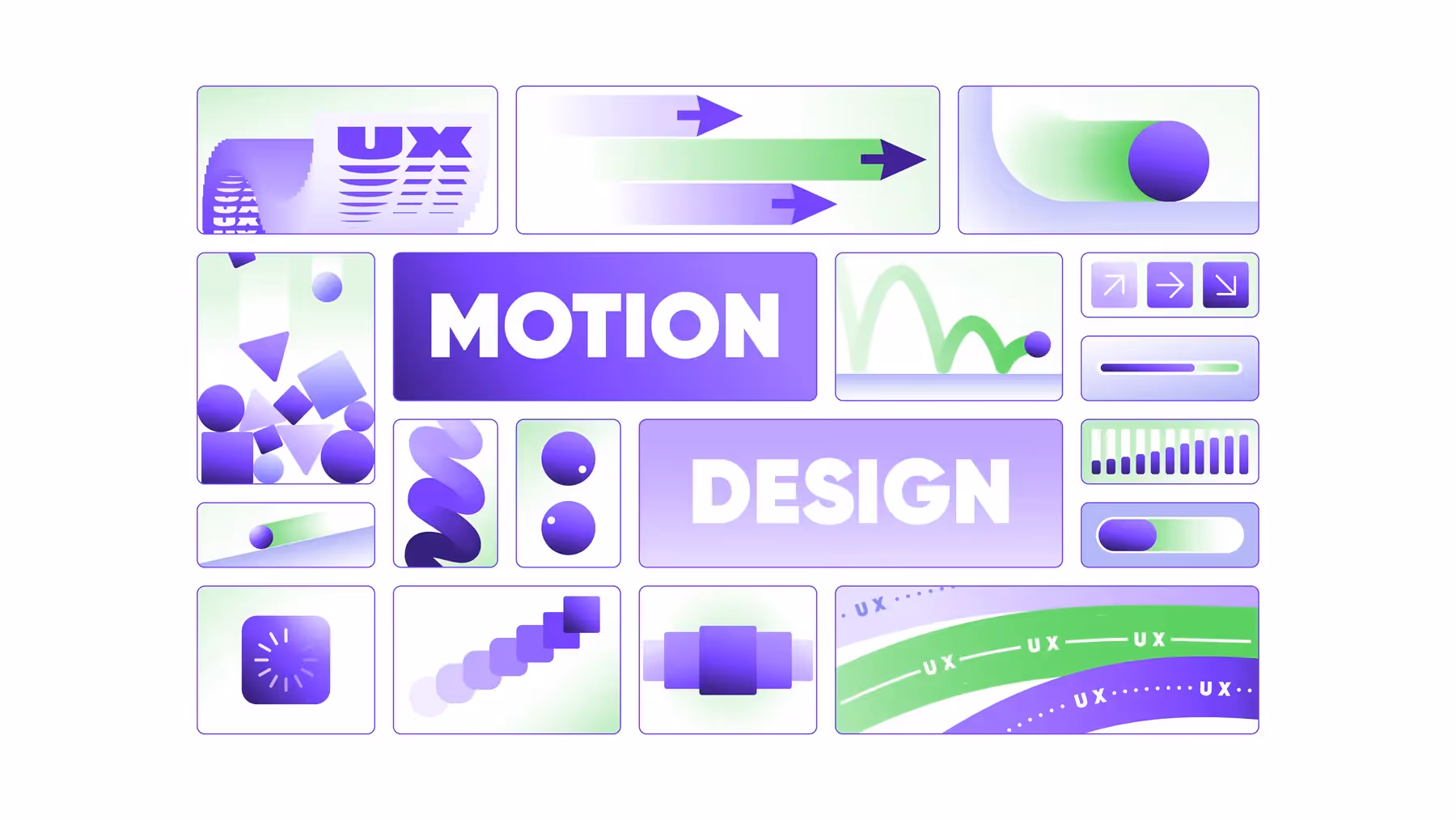
How Motion Design Enhances User Experience
