Digital Banking for Vancity
How we rebuilt Vancity's web and mobile banking platform to match their world-class member reputation.
ReImagining a banking experience for the modern user
The challenge
Vancity was losing younger members to big banks. The digital experience was outdated, clunky and lacking in a lot of basic banking functionality that most customers came to consider as baseline.
Our approach
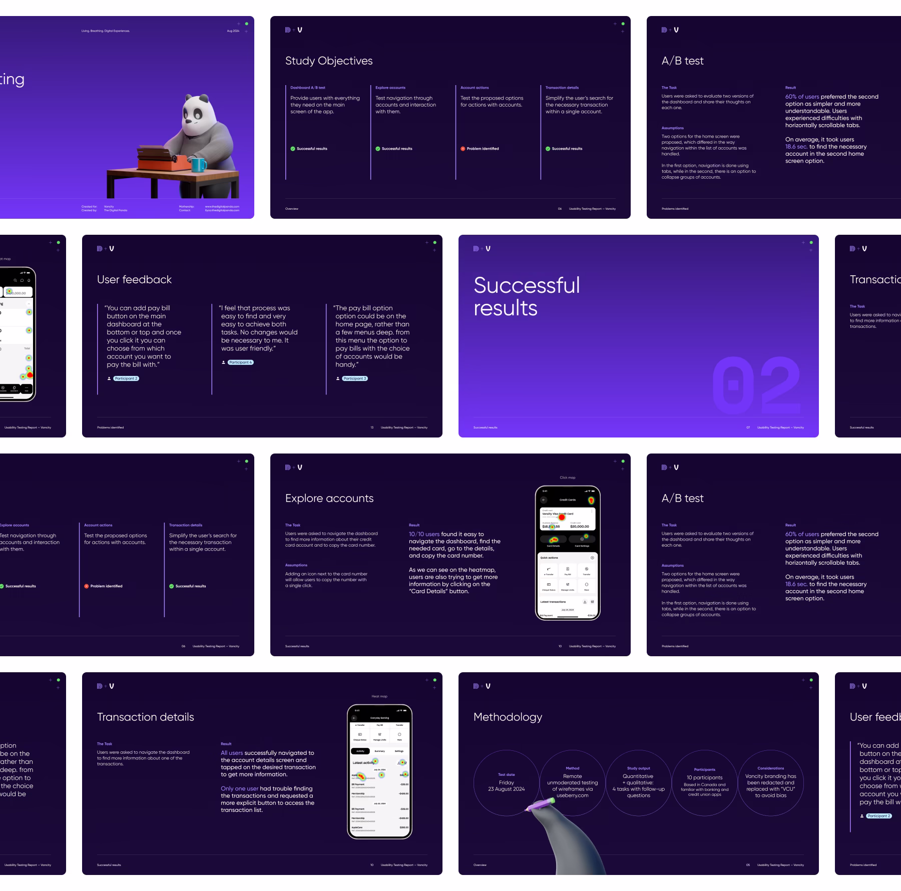
We kicked off the project with a deep-dive into Vancity's existing digital products, member feedback, and competitive landscape. Stakeholder interviews, heuristic evaluation of the current platform, and competitive benchmarking against leading fintech apps gave us a clear picture of where the experience was breaking down and what members actually needed.
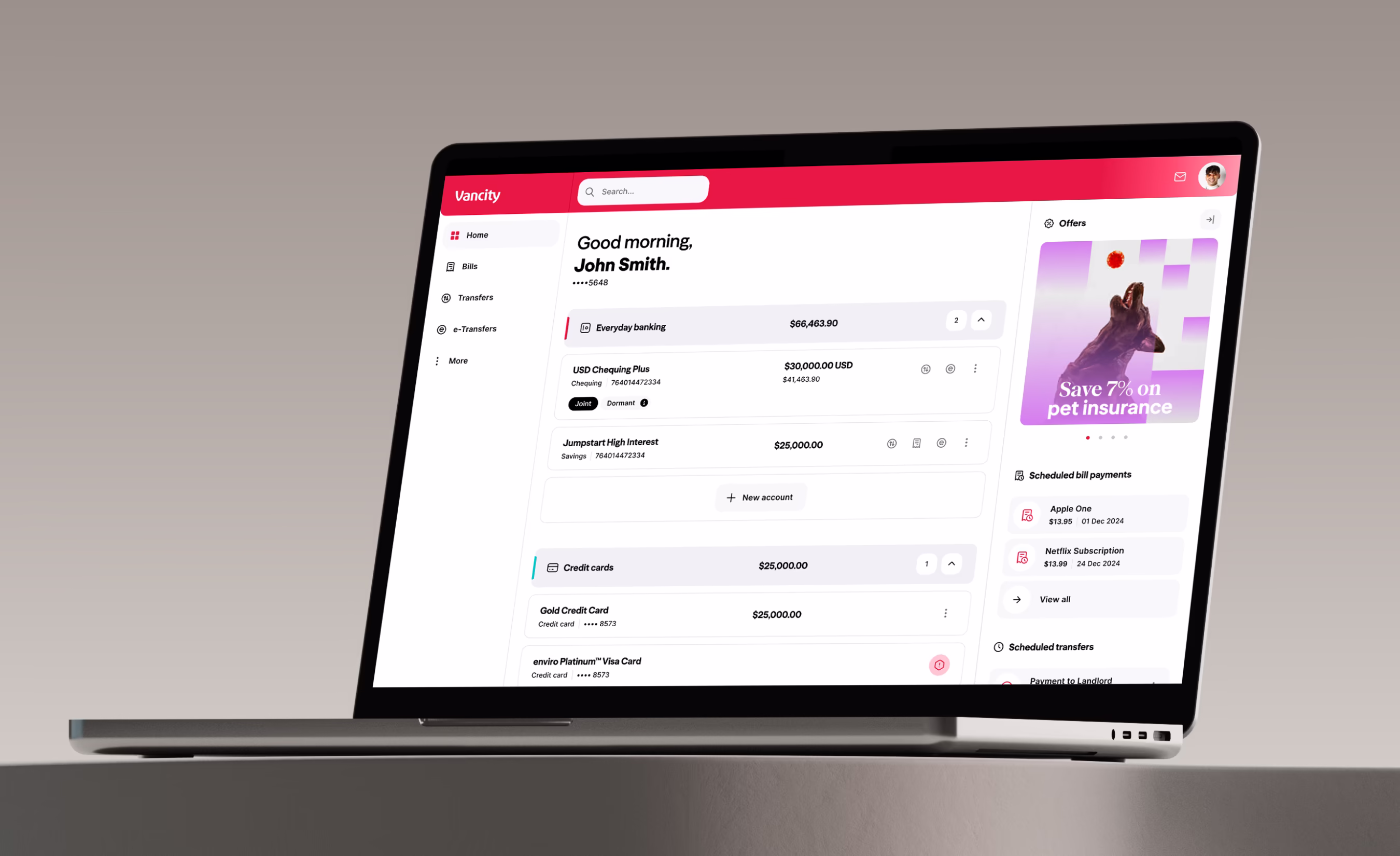
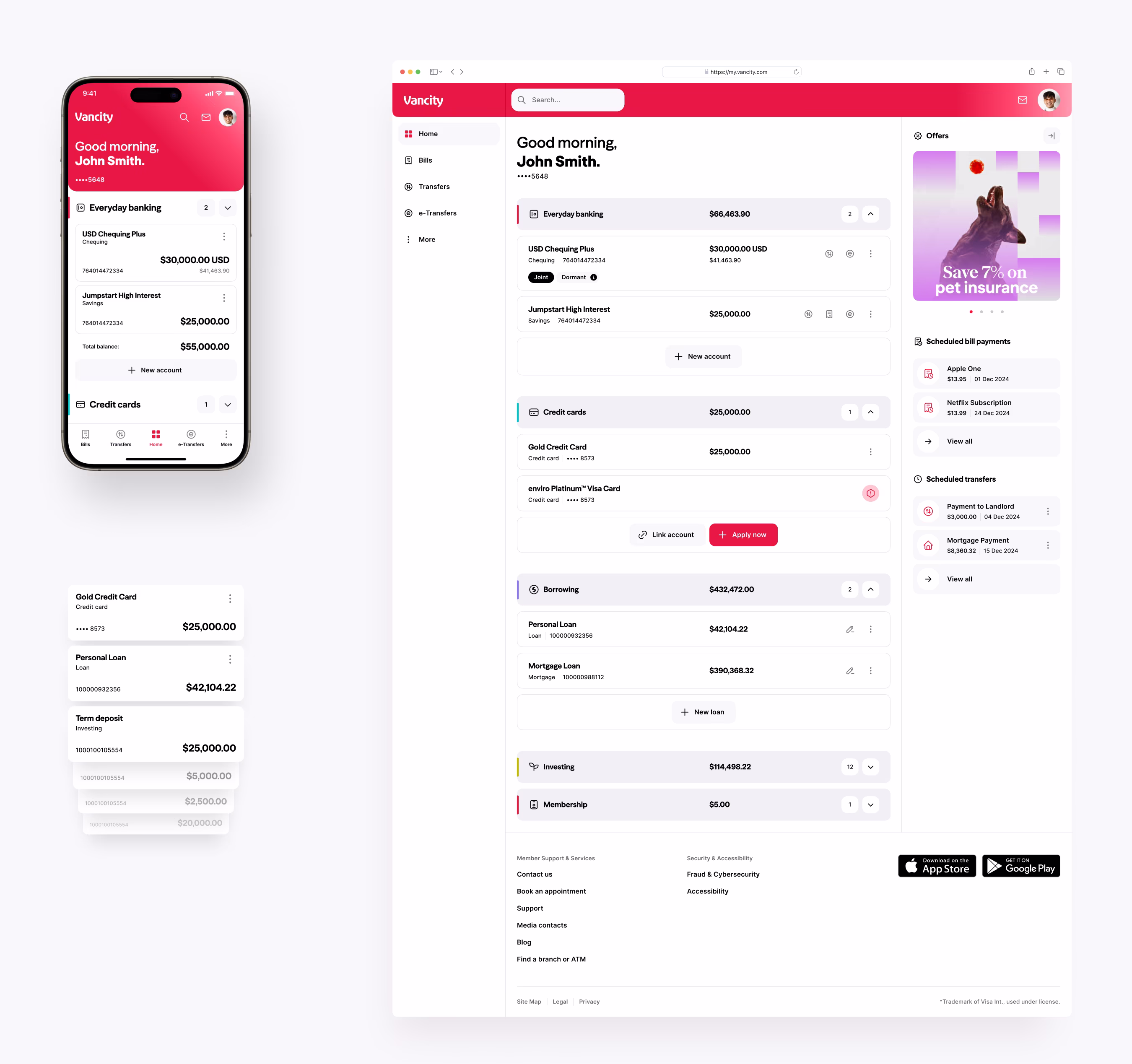
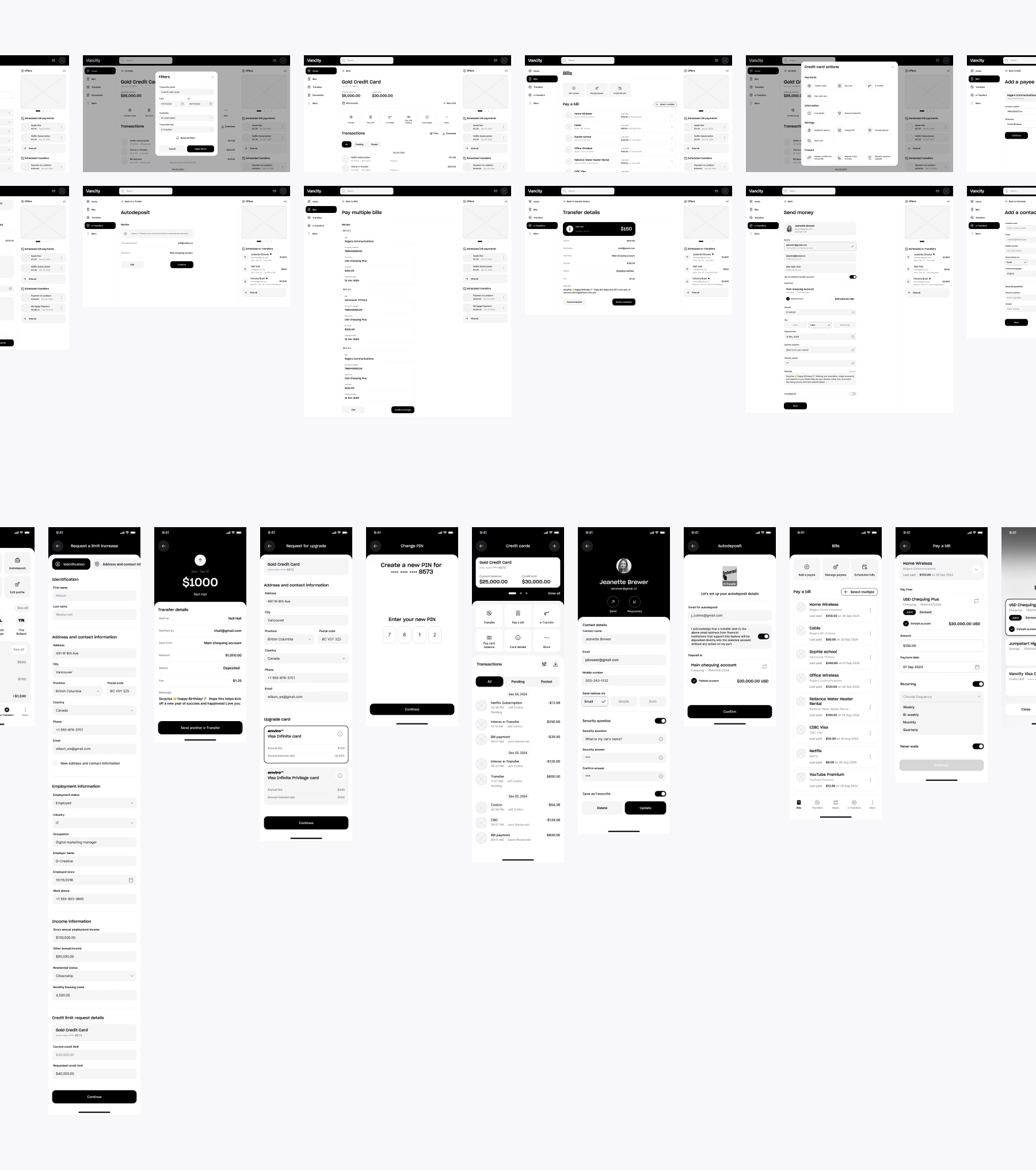
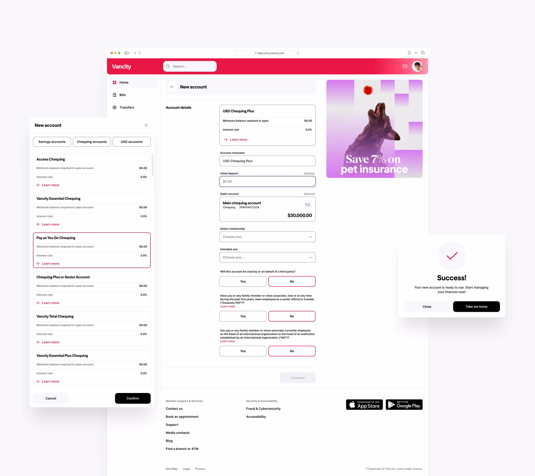
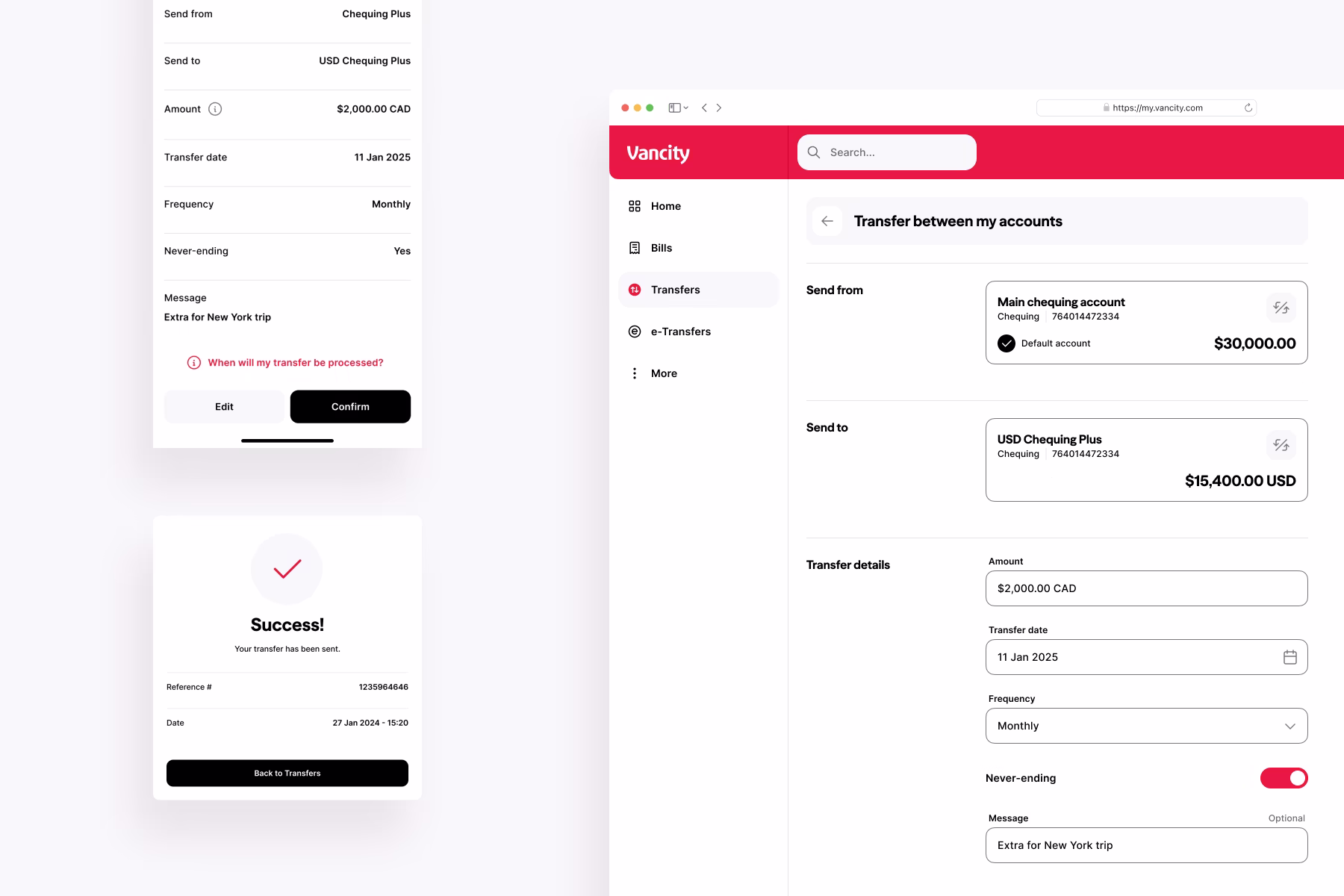
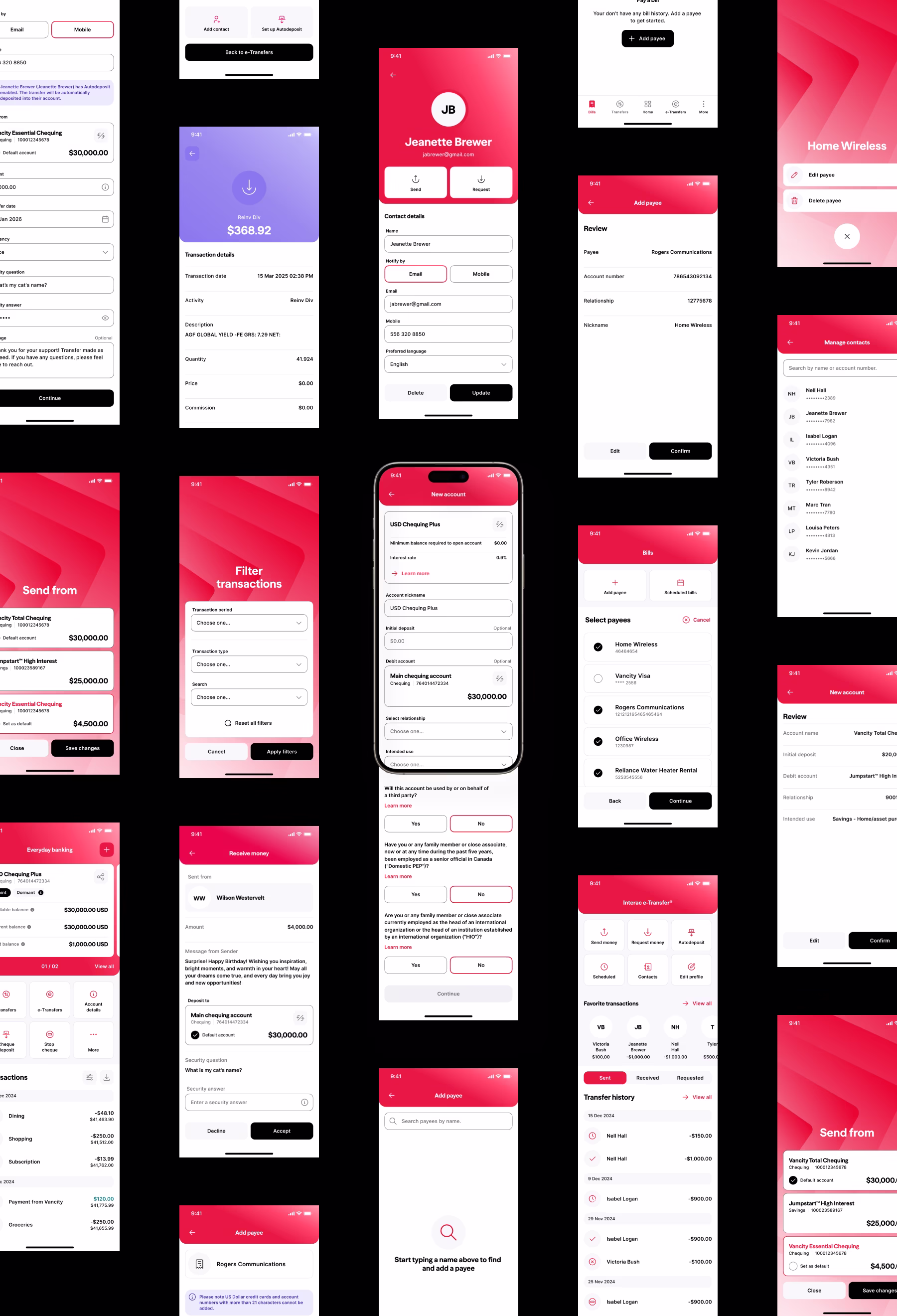
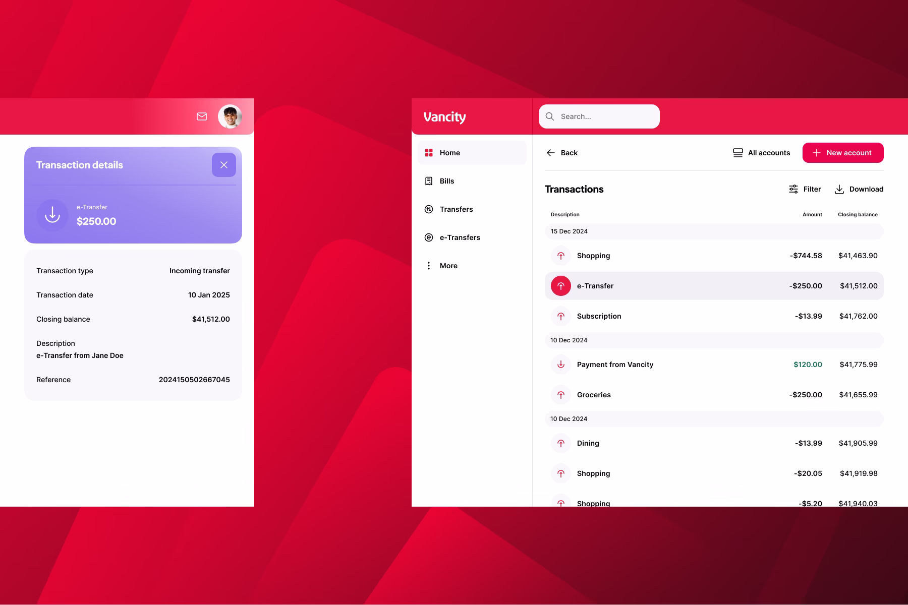
Before any visual design, we mapped out every core banking task members perform (login, dashboard, e-Transfers, bill payments, cheque deposit) through low-fidelity wireframes. Multiple rounds of internal review and user testing sessions validated navigation structure, task completion rates, and information hierarchy before we moved to high-fidelity design.
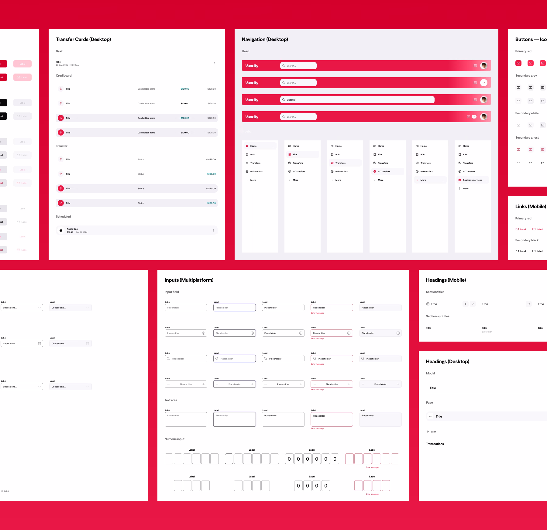
We developed a comprehensive visual design language grounded in Vancity's community-first identity, then codified it into a full component library. Buttons, inputs, navigation, cards, data display patterns, typography, and colour system designed to WCAG accessibility standards and documented for Vancity's internal team to maintain and extend well beyond the engagement.
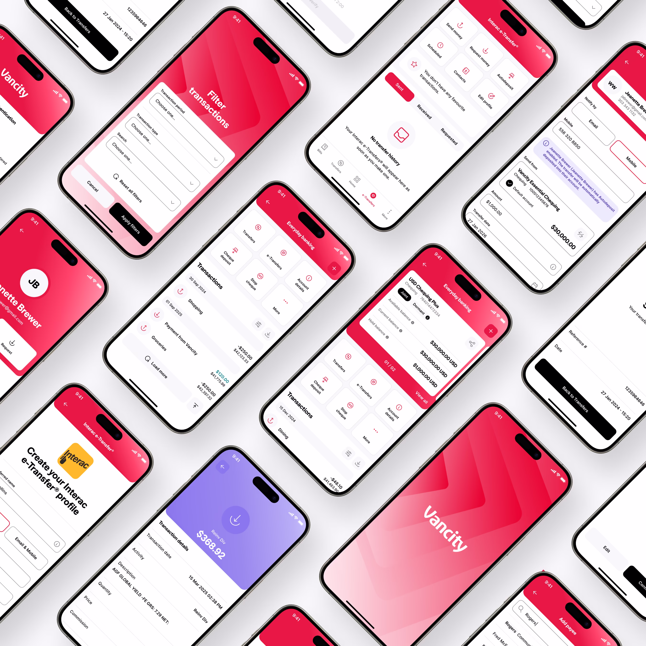
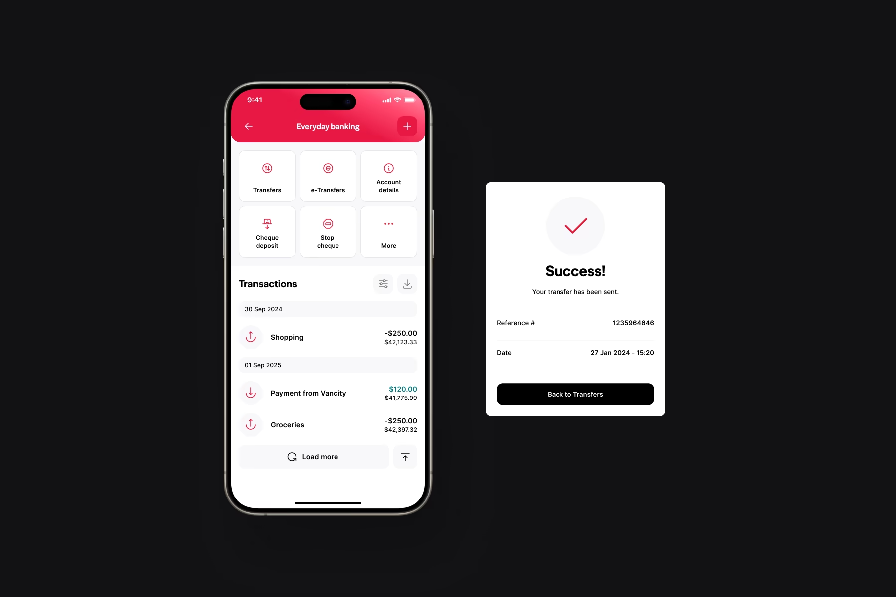
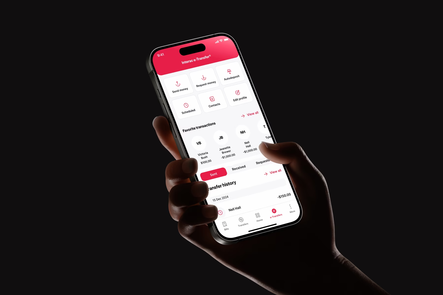
Building on the illustration system established during Vancity's rebrand, we adapted and extended it for use throughout the app experience. Micro-interactions, animated transitions, and thoughtful application of the existing visual language modernized the interface.
What
Vancity
says
"Digital Panda has been an exceptional design partner for Vancity. Their work is premium in quality and modern in style, with meticulous attention to detail throughout. They were highly flexible and brought innovative ideas that elevated our product's design. If you're looking for a team that combines creativity, precision, and forward-thinking design, Digital Panda is the perfect choice."
– Andrew Homan, VP Product
The Results
01
A modern, accessible design system that Vancity's internal team can maintain and scale.
02
Streamlined flows designed for one-and-done completion.
03
A rock-solid digital experience.
01
A modern, accessible design system that Vancity's internal team can maintain and scale.
02
Streamlined flows designed for one-and-done completion.
03
A rock-solid digital experience.
Thank you
Want to join forces?
Submit your resume and portfolio to careers@thedigitalpanda.com
Current Positions
Prototypes
Ecommerce platforms
Minimal Viable Products
VR Experiences
3D Interaction

But wait... there's more 🖼️

Ping Pong Digital


Motusbank
.avif)


